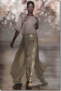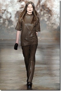
I have had the privilege of watching Sally LaPointe grow as a designer over the last few seasons from ethereal alien beauty that defied human proportions to a softer hauntingly romantic view. This season brought Sally LaPointe's architectural expertise in conjunction with softer less dramatic shapes resulting in a collection that is more commercial than previous efforts.
LaPointe's vision carefully balances the dark beauty that I have come to love with wearable pieces that I need in my closet


The scene is set with beautiful ombre rust tone walls and industrial looking pillars while experimental tracks are playing that begin to weave in the sounds of violins.


The collection started with a clean slate in head to toe cream perhaps to wipe our minds of anything that we might expect the designer to bring to the table. Fortunately LaPointe's expertise with structure and proportion served her well to create designs that are simple yet striking. The architectural elements that I've come to love like dramatic shoulders, extended peplums and cape-like sleeves are still there and the softness that last season brought is still present but there is a new slouchy/ease in some of the separates that ooze confidence and a designer coming into her own.


The designer cited Kafka the Metamorphosis highlighting the feeling of neglect and isolation as the inspiration for this collection. And you can see a slow metamorphosis in the color palette for this collection from white to blue to ombre, to dripping gold to burgundy to chocolate brown to finally black. There is also a change from lady-like to glamourous to sportswear to vamp. Some of the shapes in the collection were vaguely reminiscent of cocoons and insect wings.


No comments:
Post a Comment